All work

Café Kurubi

Brazilian flavours the world will want to taste

A family’s specialty coffee, named in Tupi and dressed in kraft and black — from the farm in Pedregulho to the cup, the shelf and its own store. Two awards in 2017.

Role

Strategy, naming, verbal & visual identity

Year

2016

Team

Espinafre Comunicadores — my studio

Client

Café Kurubi

  • 01Kurubi is a family’s coffee: more than fifty years of specialty-coffee tradition at Fazenda Santo Antônio, in Pedregulho, in the high Mogiana region of São Paulo.
  • 02The name comes from the Tupi “Itakurubi” — gravel, grain, pedregulho: the town where the coffee grows, and a small homage to the peoples who built Brazilian culture.
  • 03At Espinafre Comunicadores, my studio, we did the strategy, verbal identity, name and visual identity — then packaging, print and the brand’s own store.
Café Kurubi interface

Origin · The name

01

Gravel, in Tupi

Itakurubi means pedregulho — the town on the map where the coffee grows. The name keeps the place and the people in every cup.

Who is Kurubi?

From the Tupi-Guarani “Itakurubi” — pedregulho, gravel, grain, taken from the roots of the Brazilian people and the land our coffee grows in.

The name is a small homage to the peoples who built the pillars of Brazilian culture, and to a family’s more than fifty years of specialty coffee at Fazenda Santo Antônio.

Pedregulho — “gravel” — is also the town in São Paulo where the coffee and the brand’s story grow.
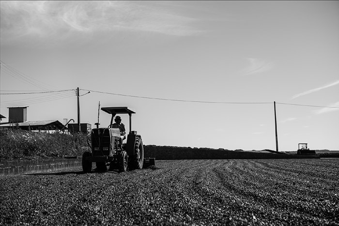
Black-and-white photo of a tractor raking coffee on the drying yard under a wide sky
Fazenda Santo Antônio

Origin · The route

02

From the farm to the world

Pedregulho to Campinas down the Anhanguera, then out to Brazil and the world. Tap a stop.

Loading map…

Origin · The story

03

A fruit of this land

The brand’s own words: a family dream, and a Brazil beyond samba, carnival and football.

Know our roots

Pedregulho, in the high Mogiana region of São Paulo, is where our coffee and our story begin. Kurubi makes a family dream real: to bring you one of the best coffees in the world, made right here, on our land.

Brazil’s flavours carry the aroma of our land and our culture — beyond samba, carnival and football — and deserve to be tasted all over the world. That mix of feeling and flavour is what gives Kurubi life: a true fruit of this land of warriors.

Muito prazer, somos Kurubi.Nice to meet you — we are Kurubi.
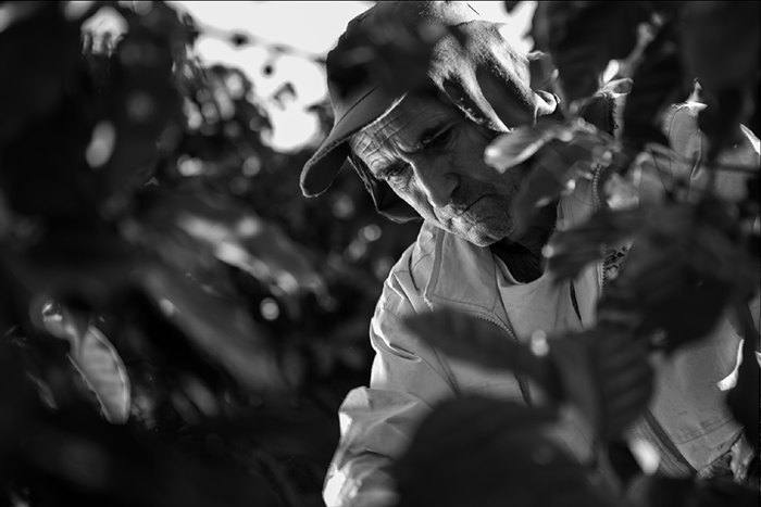
Black-and-white portrait of an older coffee picker in a cap among the leaves
Fazenda Santo Antônio

Origin · The farm

04

Fifty harvests, still by hand

The brand starts where the coffee does: the farm, the harvest and the people who still pick by hand.
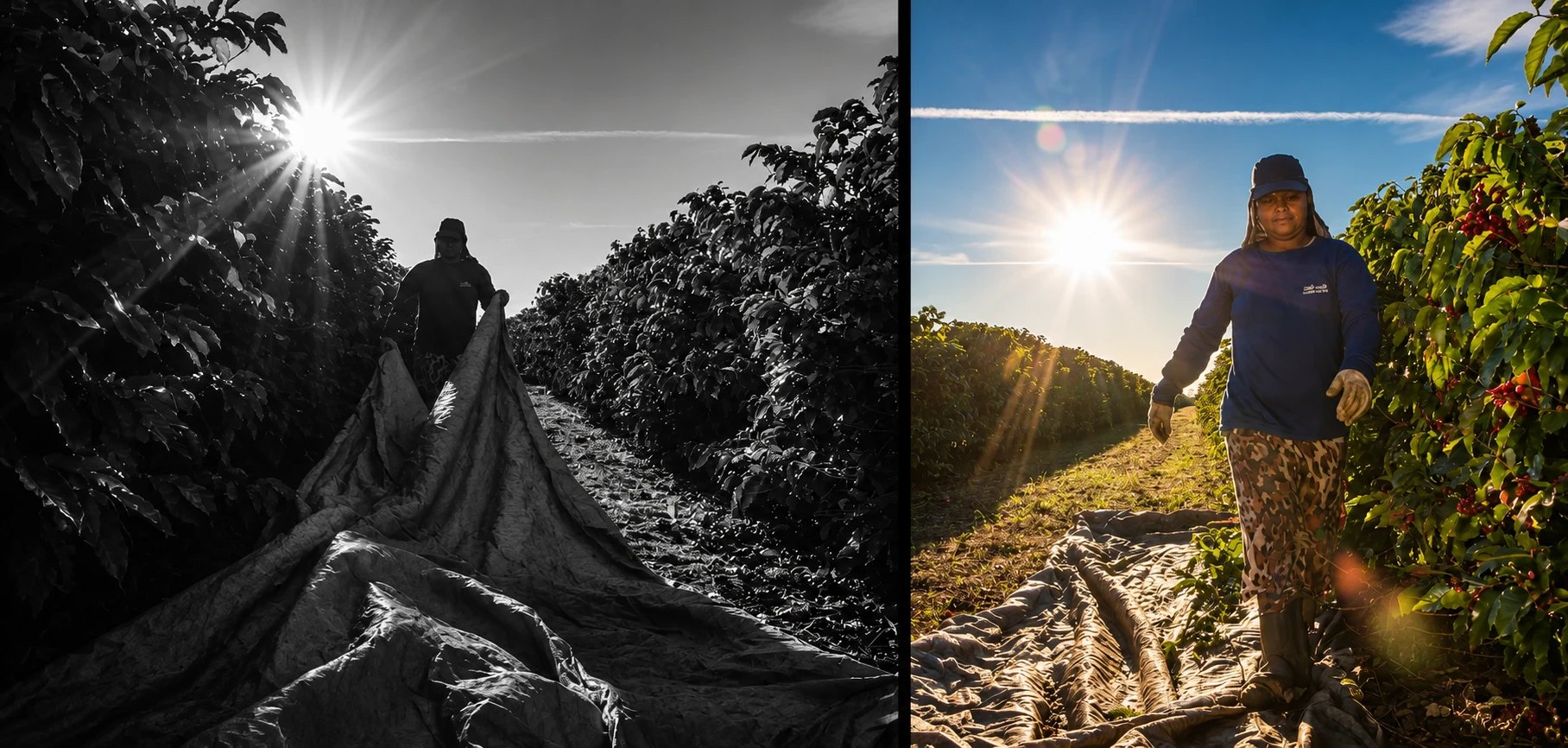

Two harvest photos side by side: a worker pulling a tarp between coffee rows in black and white, and a picker in golden light among ripe red cherries
Harvest at Fazenda Santo Antônio
Sunset over the farm: a lone tree and a line of pines in silhouette under a deep blue sky
Pedregulho, end of the day

Origin · The process

05

From the cherry to the aroma

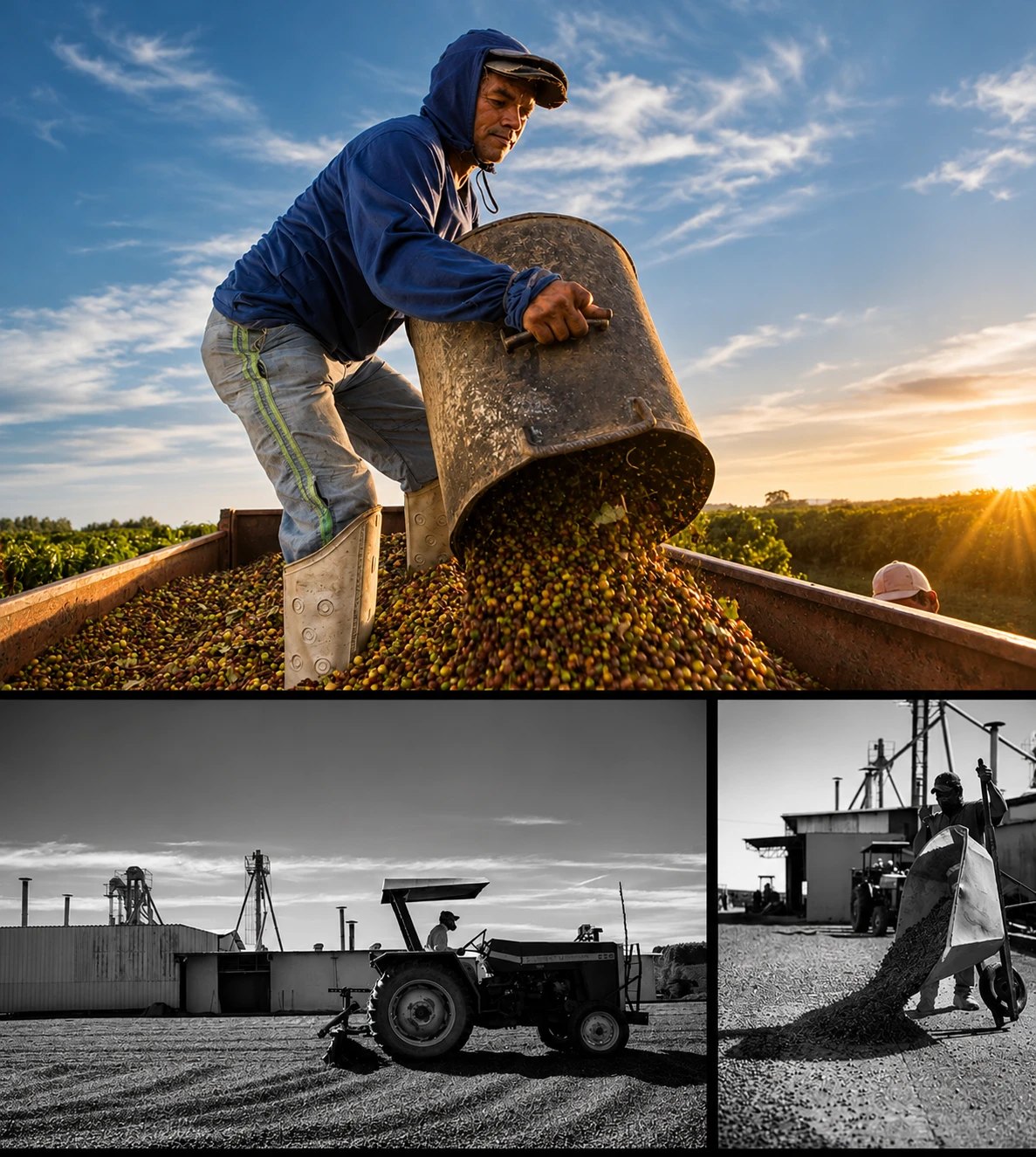
A picker pouring a bucket of coffee cherries into a trailer at sunset, above black-and-white shots of a tractor raking beans and a wheelbarrow on the drying yard
Picking and drying
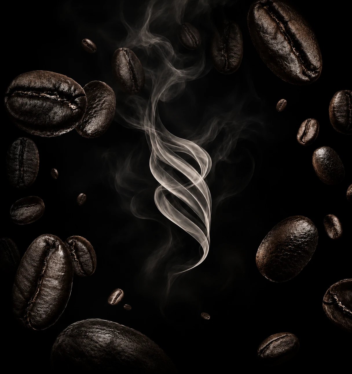
Roasted coffee beans floating in the dark around a rising curl of smoke
The aroma

Identity · Symbol and type

06

A symbol made of aroma

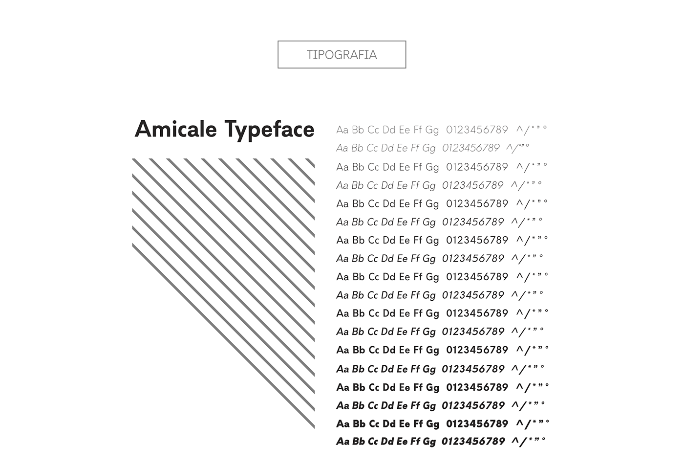
The rising lines of aroma become the symbol, and the stacked KU·RU·BI sits in a frame like a stamp on a sack. Amicale for the type.
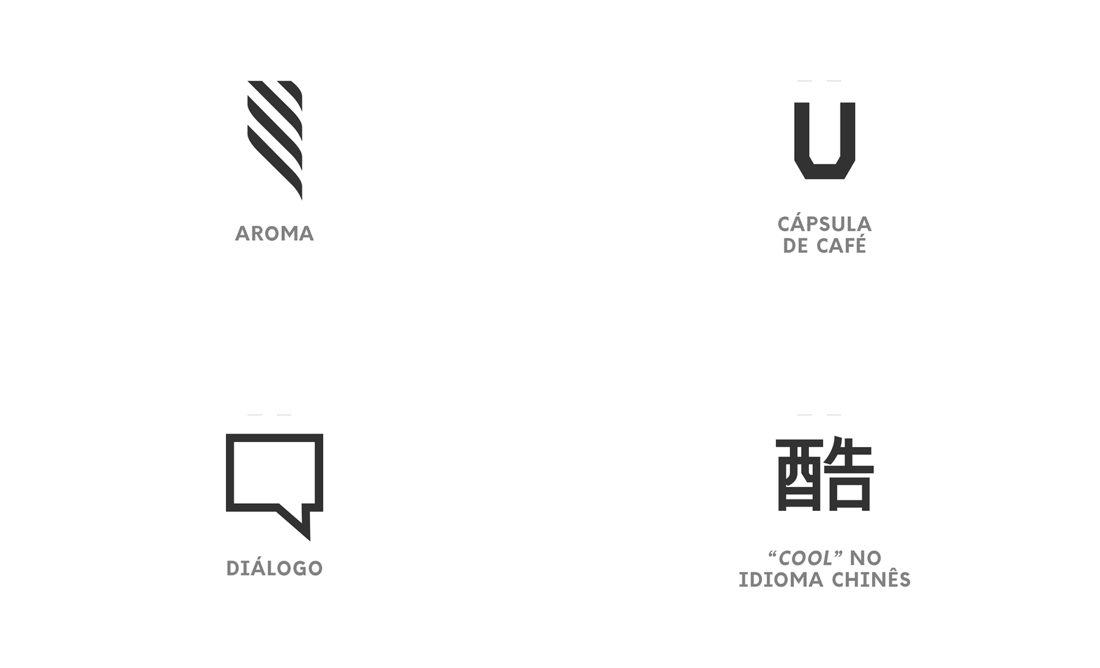
Animated icon set: the aroma symbol — diagonal stripes rising like steam — and the product icons
The symbol
Typography plate: Amicale Typeface weights beside a field of diagonal lines
Amicale

Identity · System

07

A name that travels

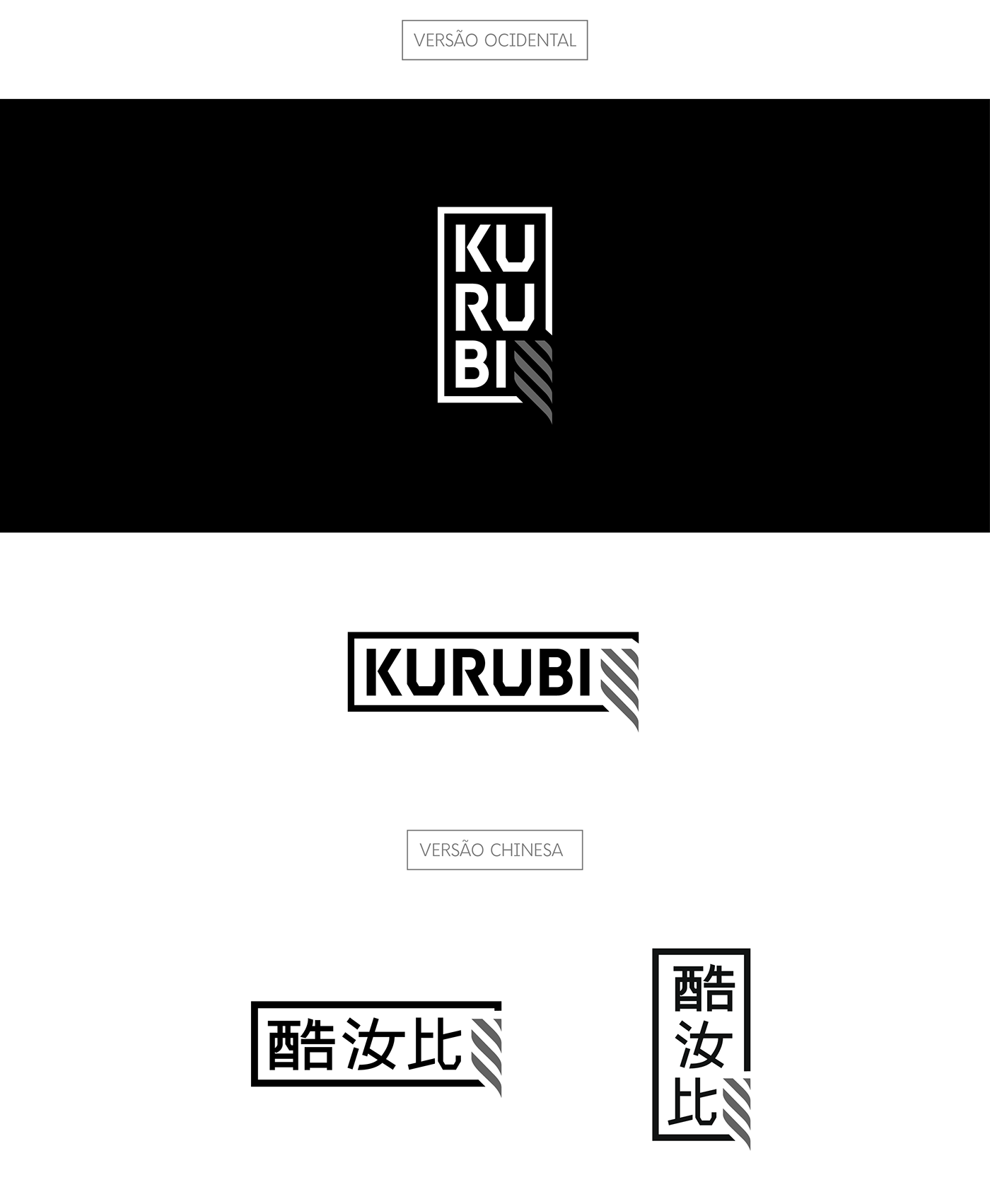
Pathways drawn in lines frame the product, and the name was set for export from day one — a Western version and a Chinese one.
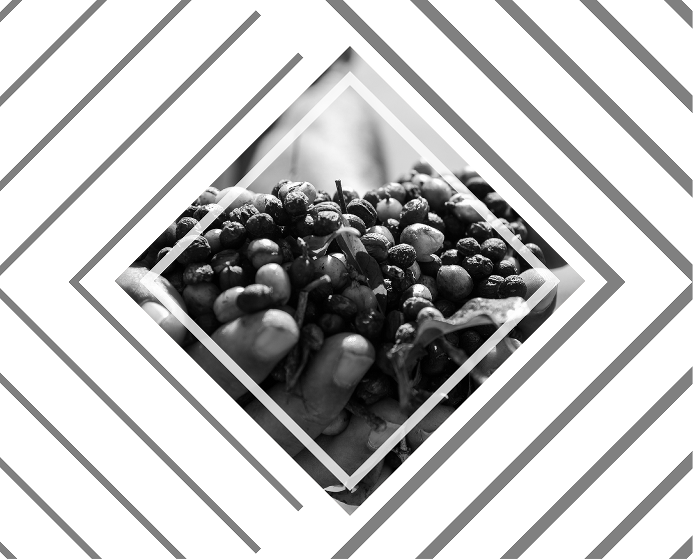
Diamond pattern of diagonal lines framing a hand holding coffee cherries in black and white
The pattern
Logo versions: stacked and horizontal KURUBI, and the Chinese version 酷汝比 in both layouts
Western and Chinese versions

Packaging · The bag

08

Kraft and black, screen-printed

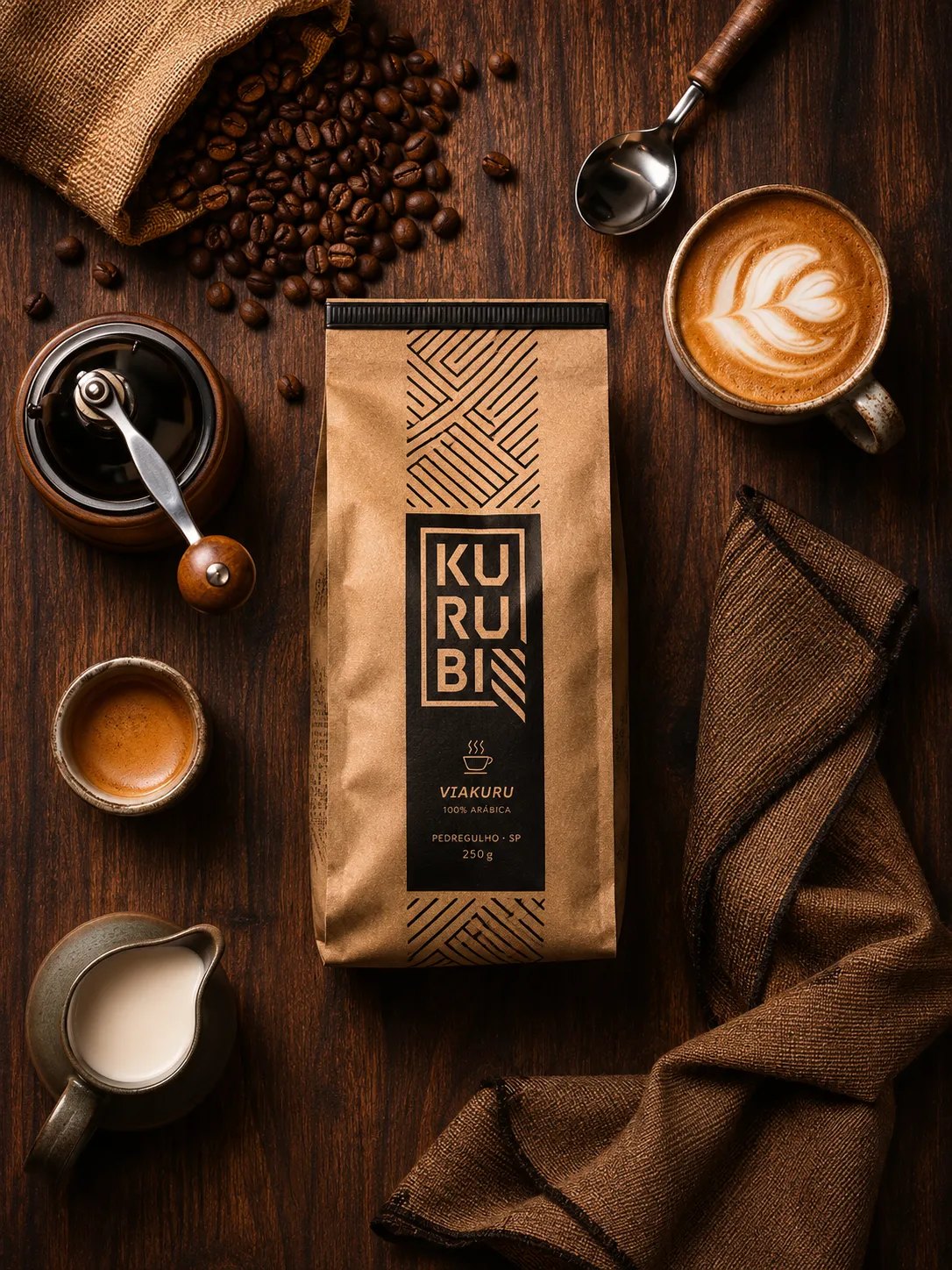
Each blend named for the land — Mundukuru, Viakuru — on kraft bags printed by screen, the pattern climbing the top of the pack.
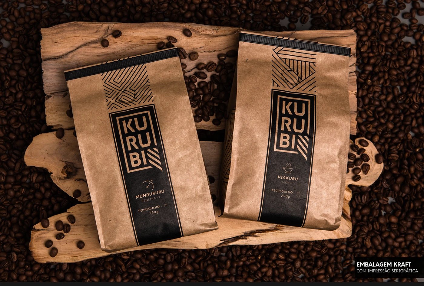
Two Kurubi kraft coffee bags, Mundukuru and Viakuru, screen-printed in black, on a piece of driftwood over roasted beans
Kraft bags, screen-printed
A Viakuru kraft bag on a wooden table among a hand grinder, a burlap sack of beans, an espresso, a latte and a milk jug
At the table

Packaging · Cans, capsules and cups

09

Cans, cups and good moments

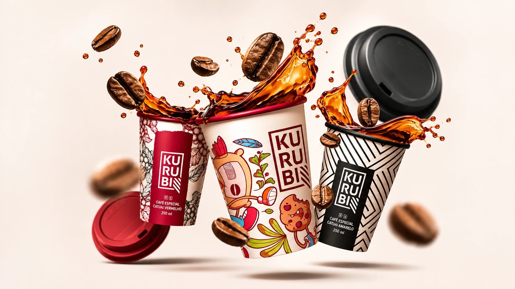
Cans, Nespresso-compatible capsules, to-go cups in three varieties and a gift box that says what to do with it: aproveite bons momentos.
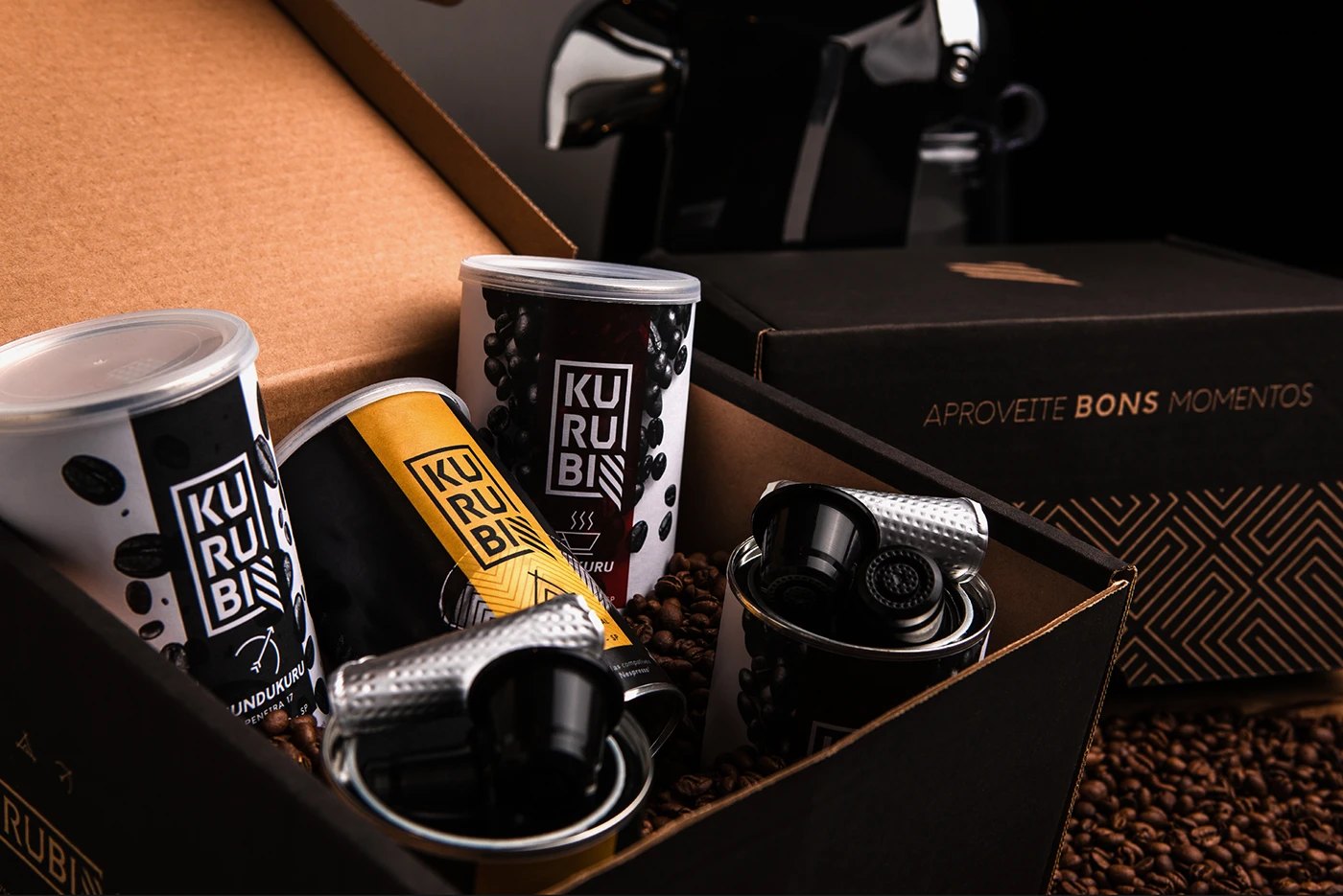
Kurubi gift box with patterned lid, cans in white, yellow and red, and capsules among coffee beans
The gift box
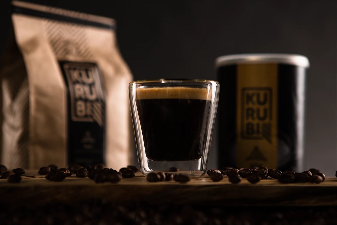
An espresso in a double-walled glass between a blurred kraft bag and a gold Kurubi can
In the cup

Print · Folder and cards

10

Know our roots

A folder that walks from the farm to the flavours, and cards in the same black-and-white language.
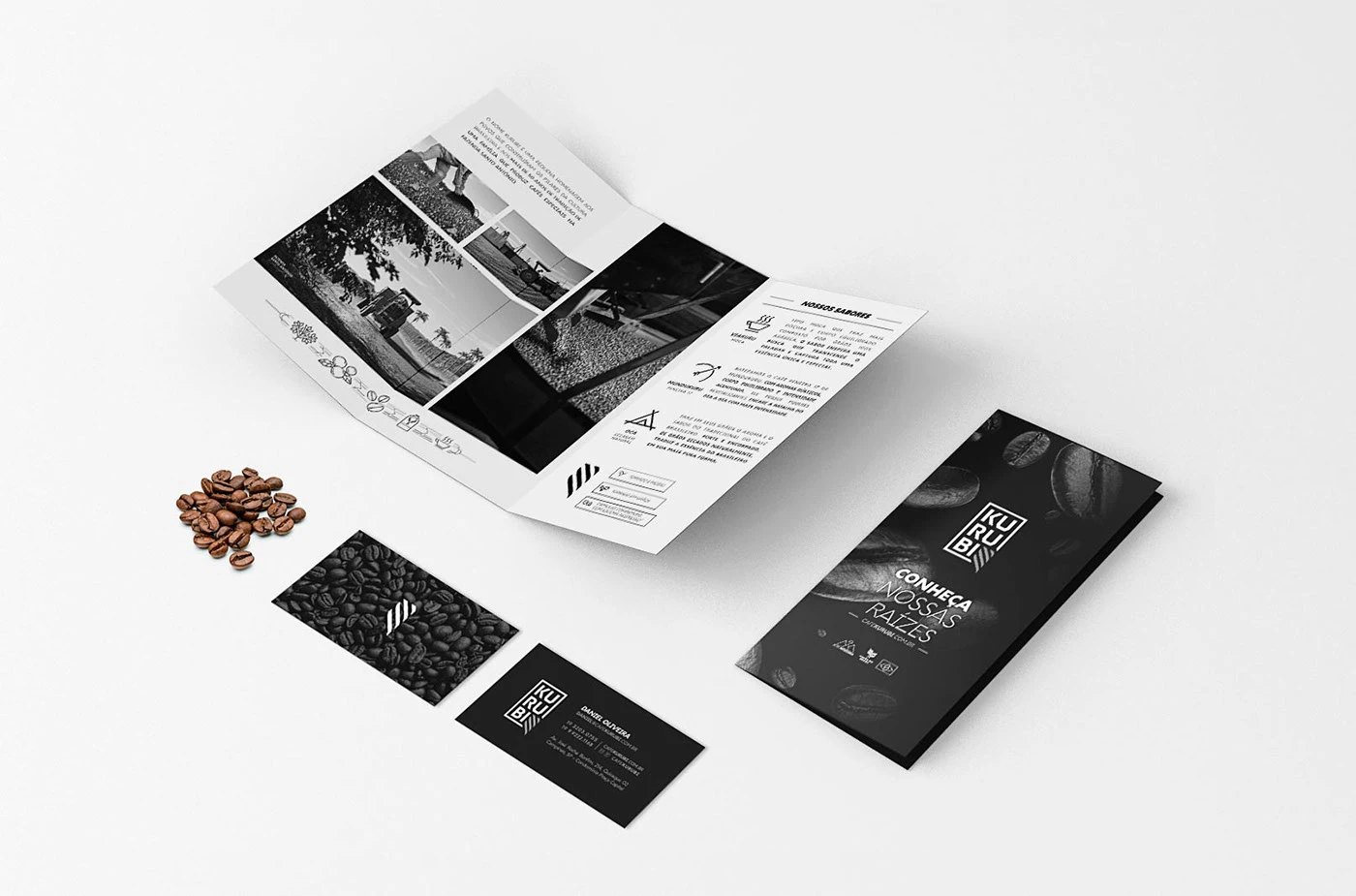
Kurubi print: an open folder with farm photos and flavour icons, its black cover “Conheça nossas raízes”, and two business cards beside coffee beans
Folder and cards
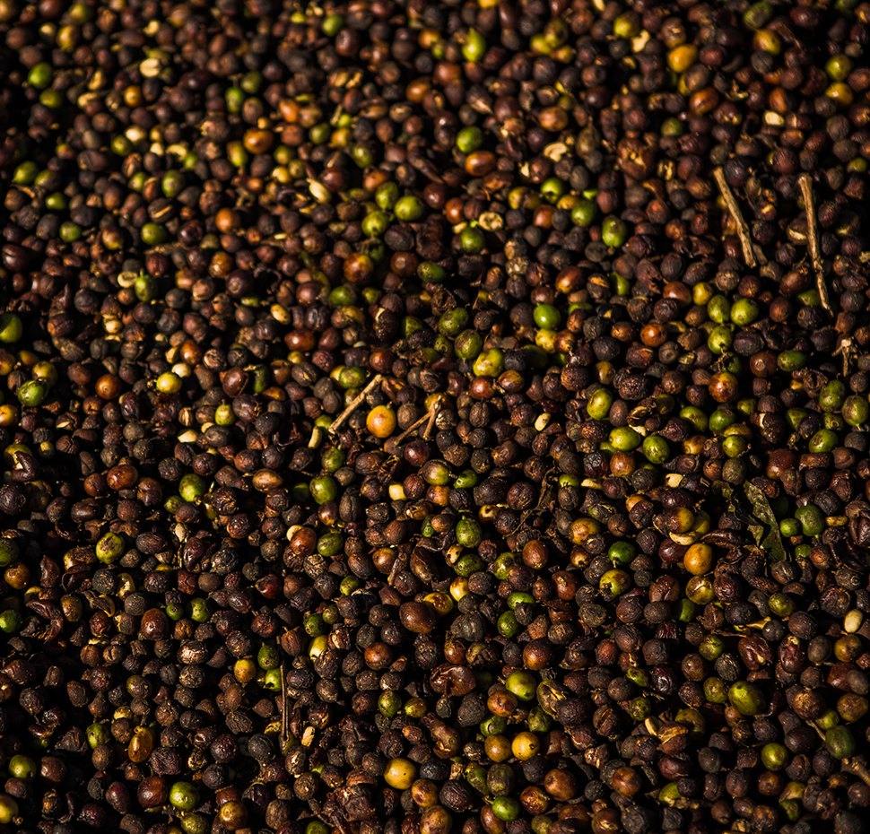
Coffee cherries drying, from deep brown to green and amber, filling the frame
The cherries

Retail · The store

11

The brand, as a place

The pattern became a glass wall and the tagline a fascia: Sabores do Brasil que o mundo vale a pena provar.
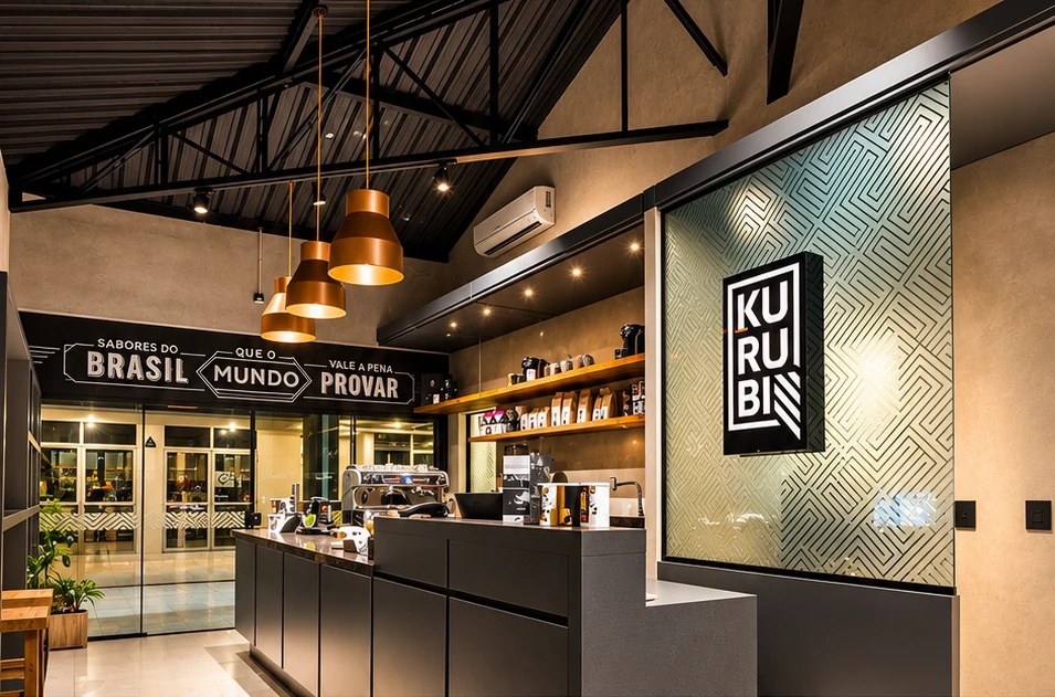
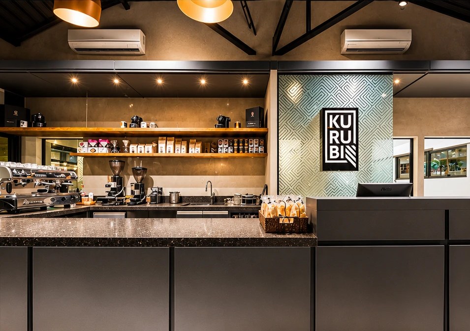
Kurubi store: counter under copper pendant lamps, a lit KURUBI sign on a patterned glass wall, and the “Sabores do Brasil que o mundo vale a pena provar” fascia
The counter
Kurubi store: espresso bar and shelves of bags and cans beside the patterned glass wall with the KURUBI sign
The bar

Retail · The store

12

Room to stay

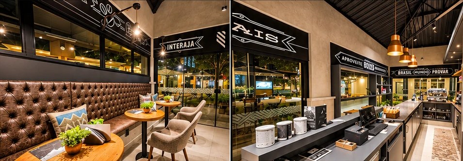
Kurubi store lounge: tufted leather banquette and small tables by the window, and the retail counter with cans under black signage
The lounge

Recognition

13

Bronze and gold, 2017

Bronze for branding at Mídia Festival and gold for packaging and label at Festgraf.
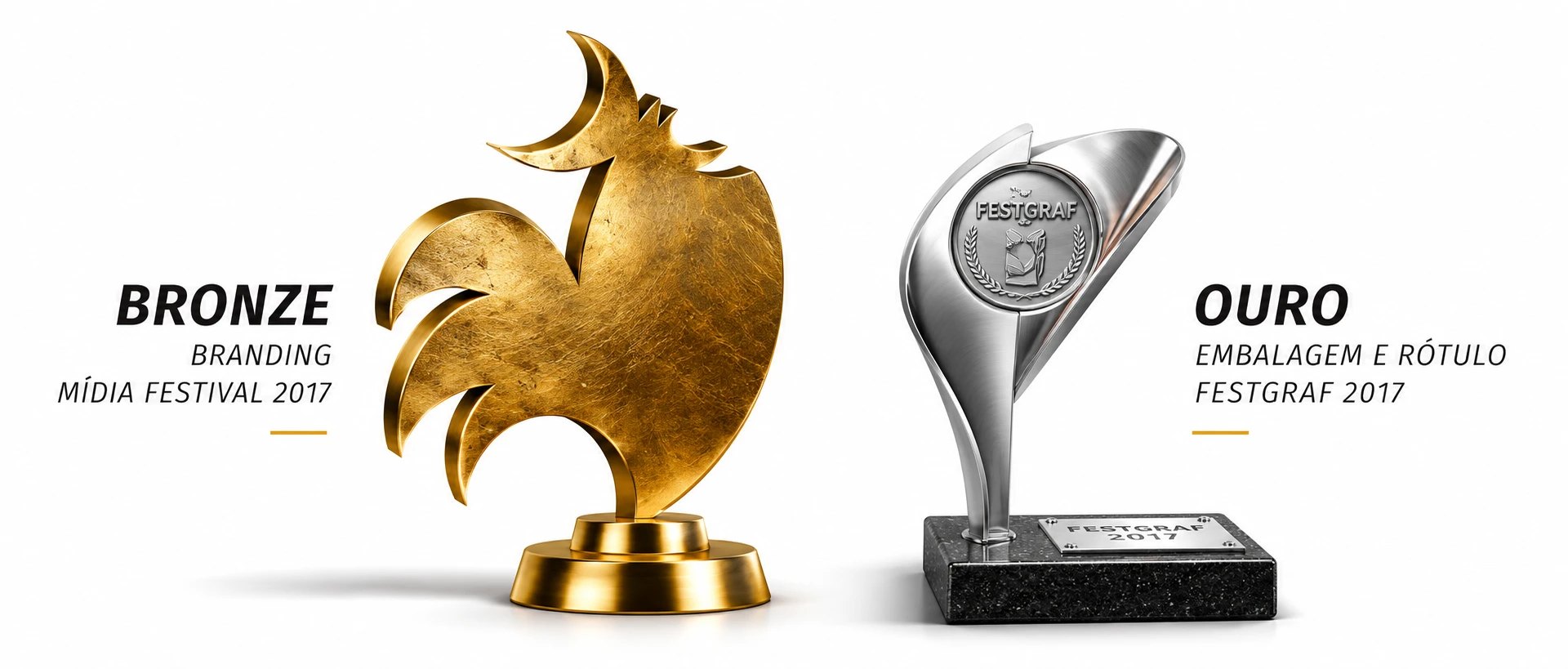
Two trophies: a gold rooster for Bronze in Branding at Mídia Festival 2017, and the Festgraf trophy for Gold in Packaging and Label 2017
Mídia Festival · Festgraf

“Brazilian flavours the whole world will want to taste.”

— Café Kurubi — tagline

Credits

Architecture
Vanessa Vialli
Photography — products and farm
Marcus Steinmeyer
Photography — store
Fernando Righetto
Mostrando em português