All work

Hop Hunters Brasil

A beer club’s identity, from first box to last

The rebrand of a Brazilian craft-beer subscription club — a symbol drawn from a bottle and a hop hunter’s scope, carried onto every box, coaster and glass for seven more years.

Role

Brand designer

Year

2016

Team

Independent

Client

Hop Hunters Brasil

  • 01Hop Hunters Brasil was a subscription club: every month, a curated box of national craft beers delivered to hundreds of members across the country.
  • 02Its first mark (2013) was a Brazilian flag with a rifle scope — patriotic, but closer to a souvenir than a brand. By 2016 the club had outgrown it.
  • 03The brief: keep the hunt and keep Brazil, lose the flag — and give a growing club an identity that could live on boxes, glasses and merch.
Hop Hunters Brasil interface
01

Um novo momento se desenha

Same name, same mission, a new mark. The flag and scope gave way to a single symbol, a hand-adjusted logotype and a tagline that said what the club sold: Essência Artesanal.
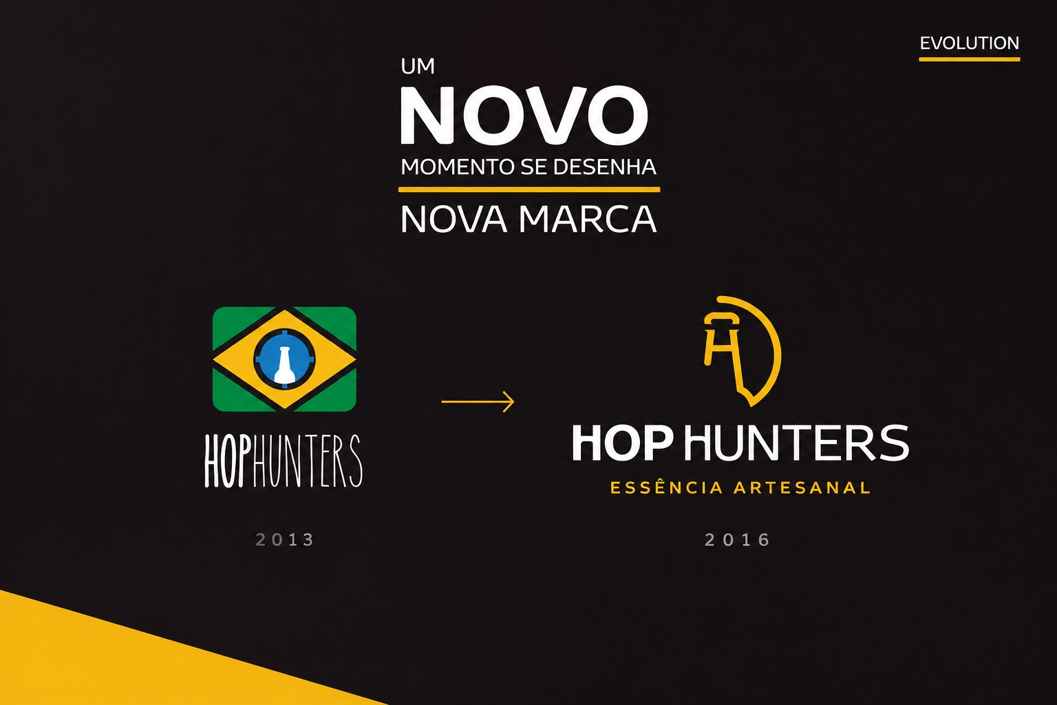
Hop Hunters logo evolution: the 2013 flag-and-scope mark beside the 2016 symbol and logotype
2013 → 2016
02

From scope to symbol

The old scope became a bottle, the bottle became an H, and the scope’s ring opened into an arc — a hunter’s sight drawn in one stroke. Four steps, one mark.
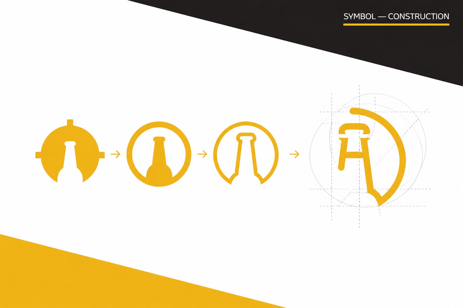
Symbol construction: a scope with a bottle simplifies step by step into an H inside an open arc, on a construction grid
Construction
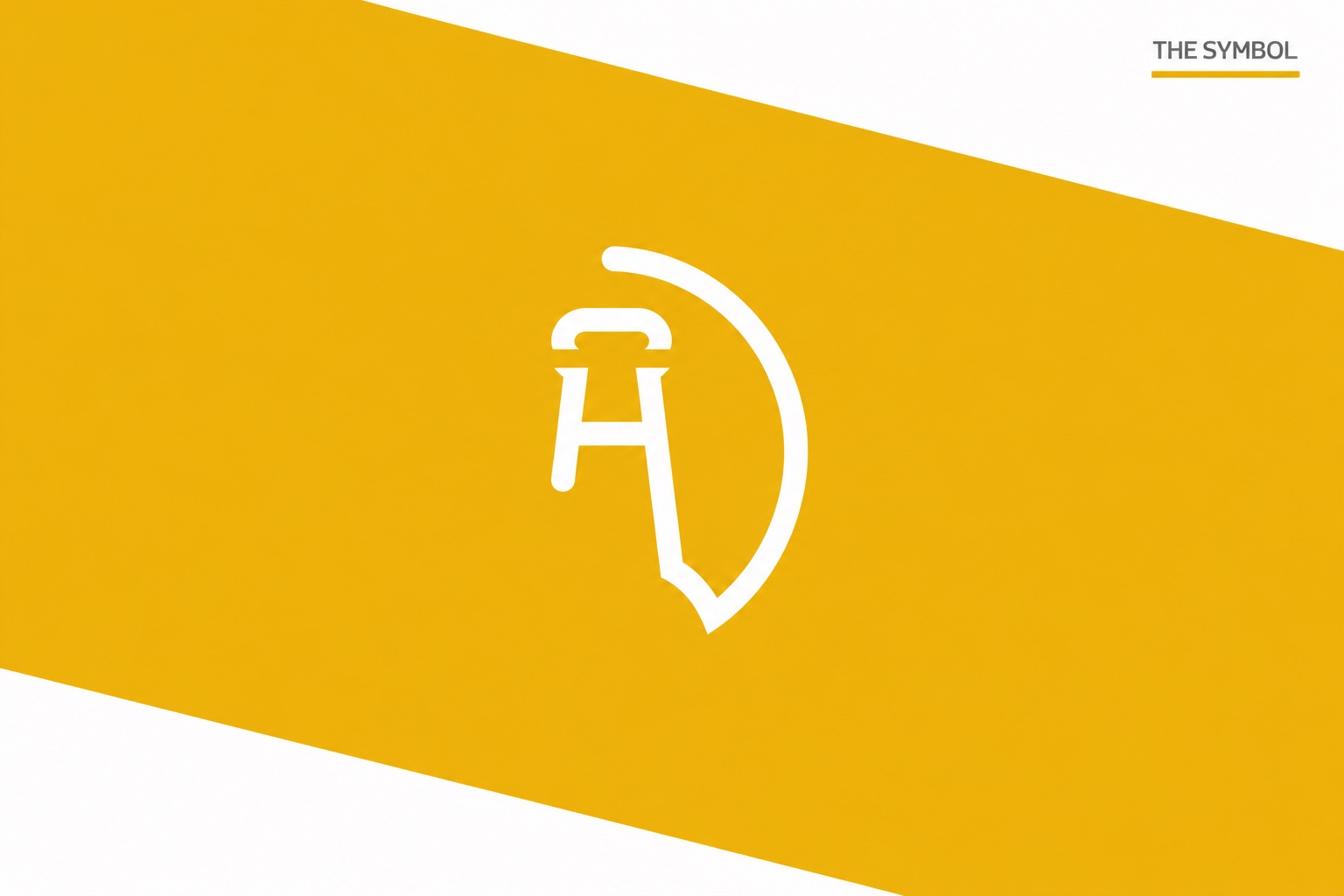
The final Hop Hunters symbol in white on a gold diagonal band
The symbol
03

Type, color, system

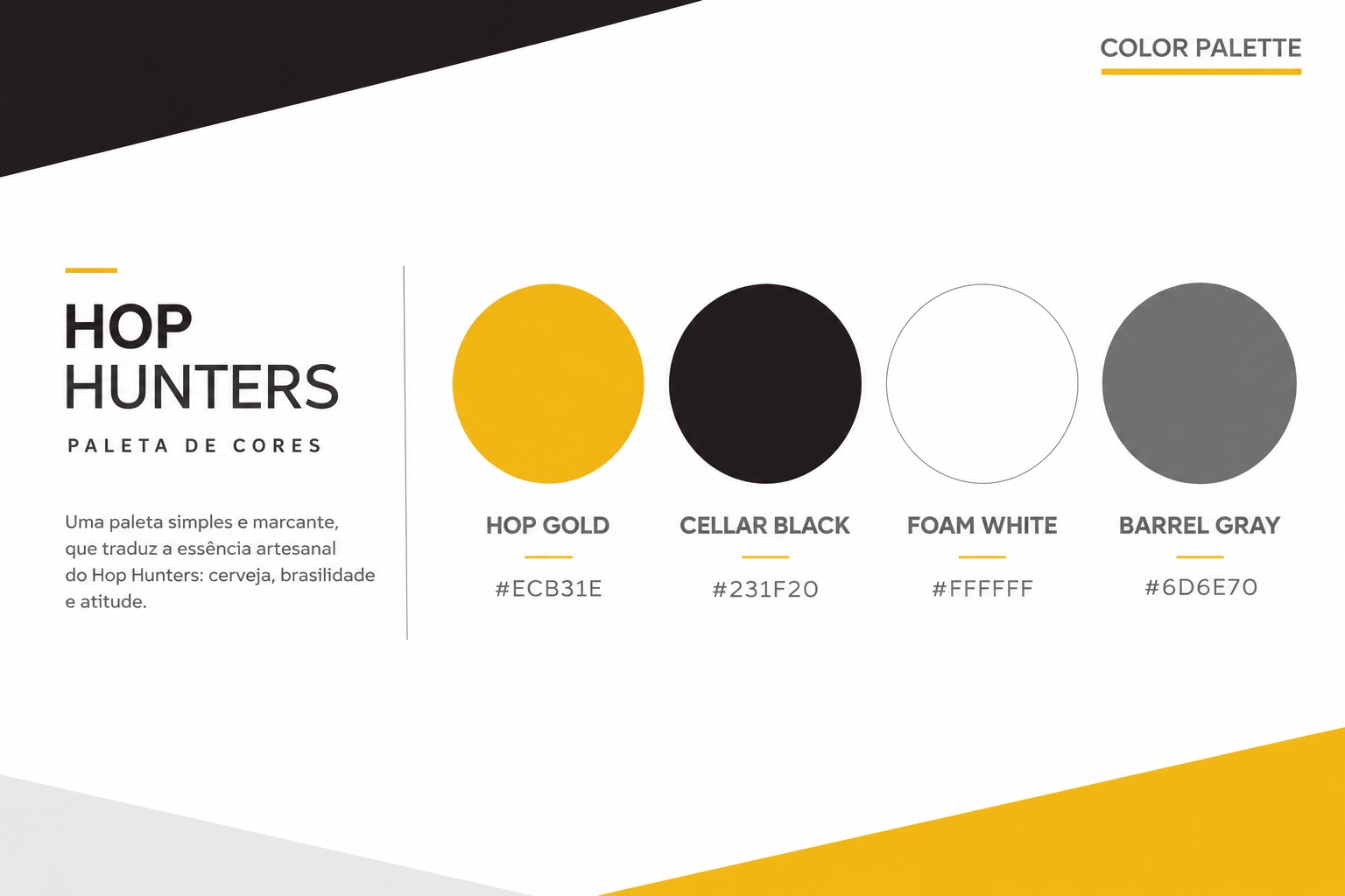
Toyota Display in Bold and Regular, with the h’s adjusted to sit with the symbol. A short palette named after the product — Hop Gold, Cellar Black, Foam White, Barrel Gray — and a system with clear space and a 30 mm minimum.
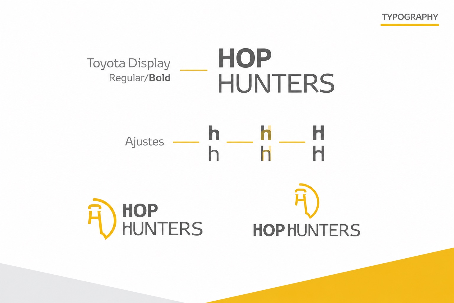
Typography: Toyota Display Regular and Bold, letter adjustments, and the horizontal and stacked lockups
Typography
Color palette: Hop Gold #ECB31E, Cellar Black #231F20, Foam White #FFFFFF, Barrel Gray #6D6E70
Palette
04

Built to repeat

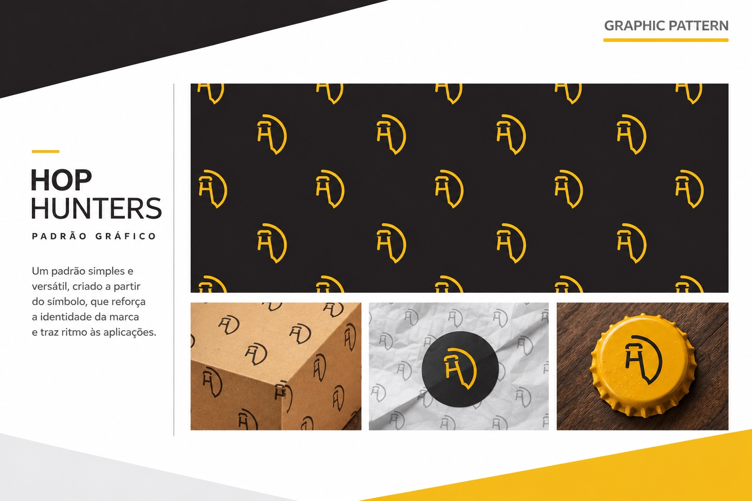
Four versions for any ground, and a pattern from the symbol alone — the piece that did the most work once the club started shipping.
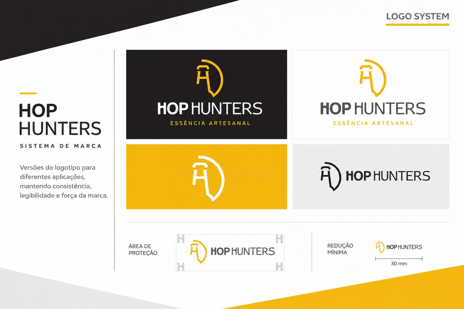
Logo system: signature on black, white, gold and gray, with clear space and minimum size
Logo system
Graphic pattern of the symbol on black, kraft box, tissue paper and a gold bottle cap
Pattern
05

The box was the brand

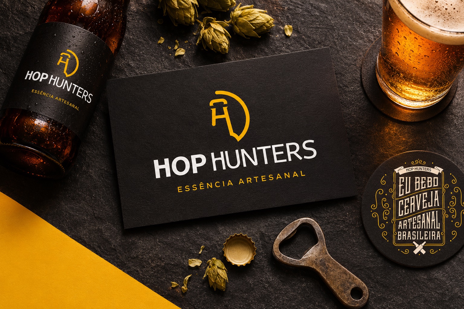
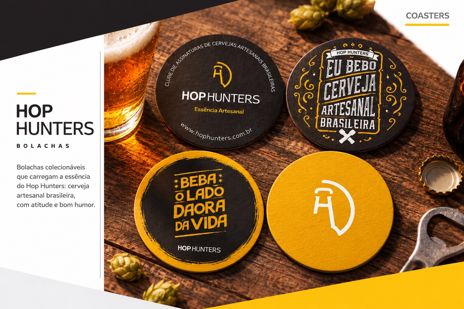
For a subscription club, the unboxing is the store. The kraft box, the welcome lid, the collectible coasters with the club’s own sayings — “Eu bebo cerveja artesanal brasileira”, “Beba o lado daora da vida”.
The club box opened: three labelled bottles, a branded glass and a welcome message on the lid
Caixa do clube
Four collectible coasters on a wooden table: the signature, “Eu bebo cerveja artesanal brasileira”, “Beba o lado daora da vida”, the symbol
Bolachas
06

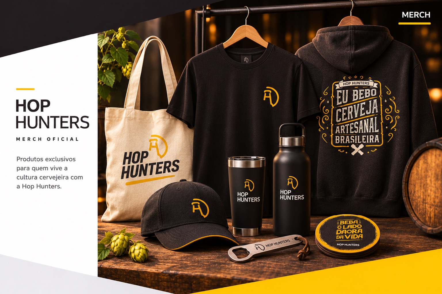
Everything a hunter carries

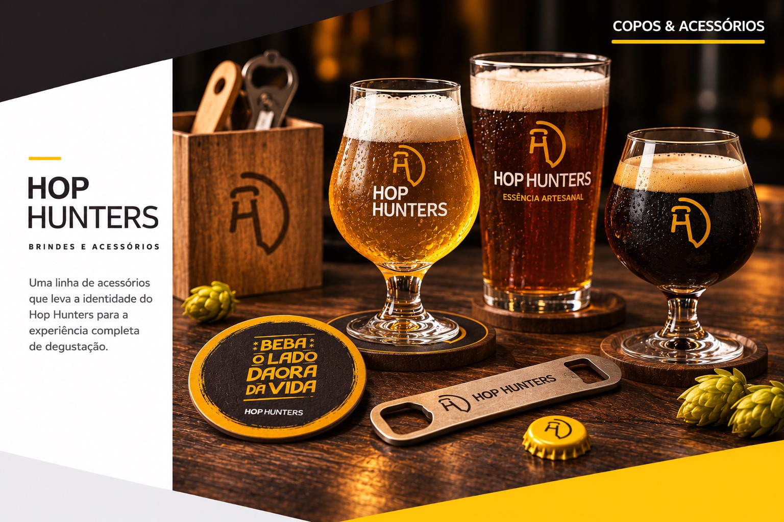
Branded tulip and pint glasses, a bottle opener, coasters and a gold cap on a bar
Copos & acessórios
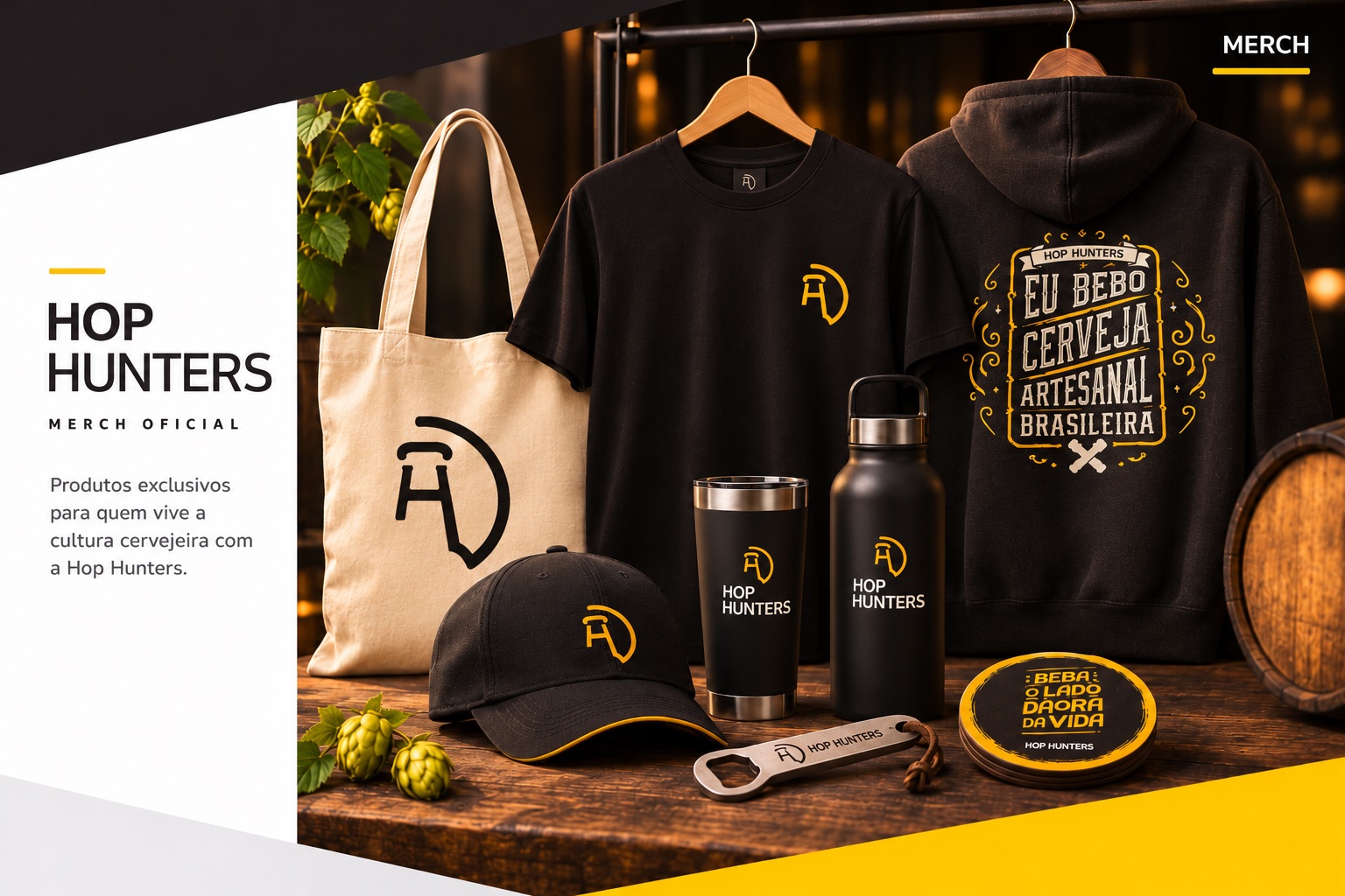
Merch: tote, t-shirt, hoodie, cap, tumbler, bottle and opener
Merch
07

The club online

Reviews, launches, events and a community around Brazilian craft beer — the site was where members signed up, and where the club said goodbye.
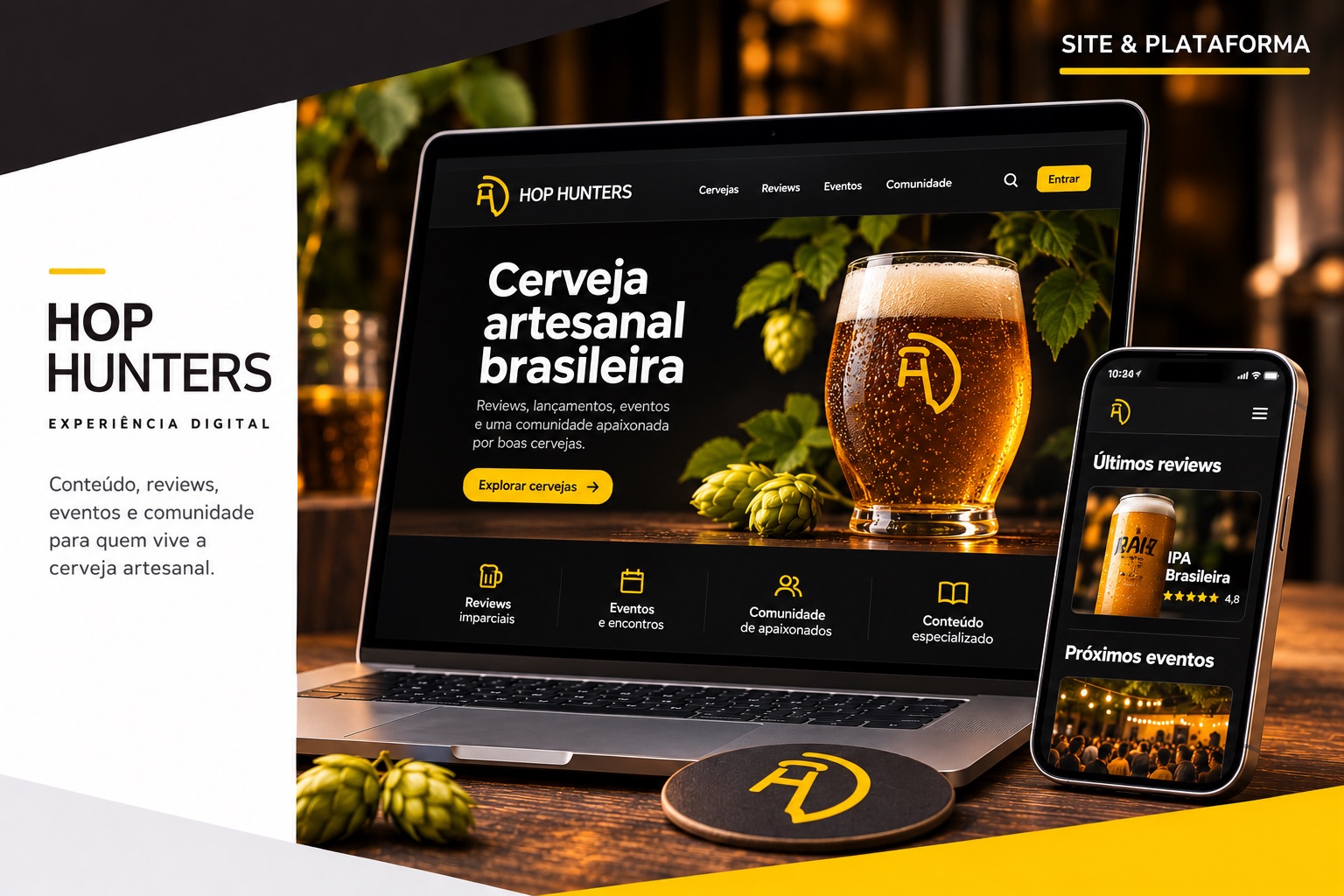
The Hop Hunters site on a laptop and phone: “Cerveja artesanal brasileira” hero, reviews, events and community sections
Site & plataforma
08

In the wild

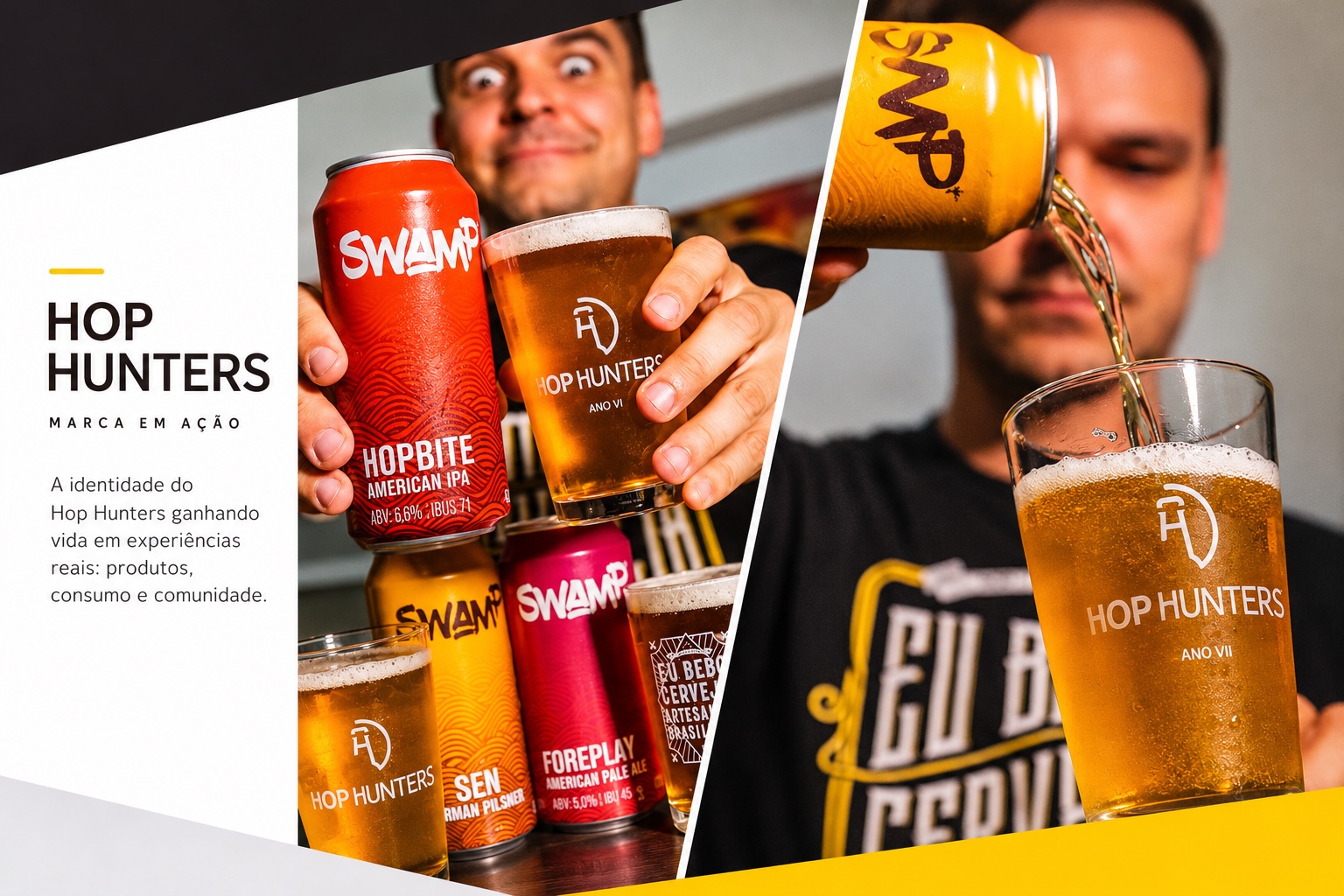
The glasses carried the year — Ano VI, Ano VII — so every member’s shelf became a timeline of the club.
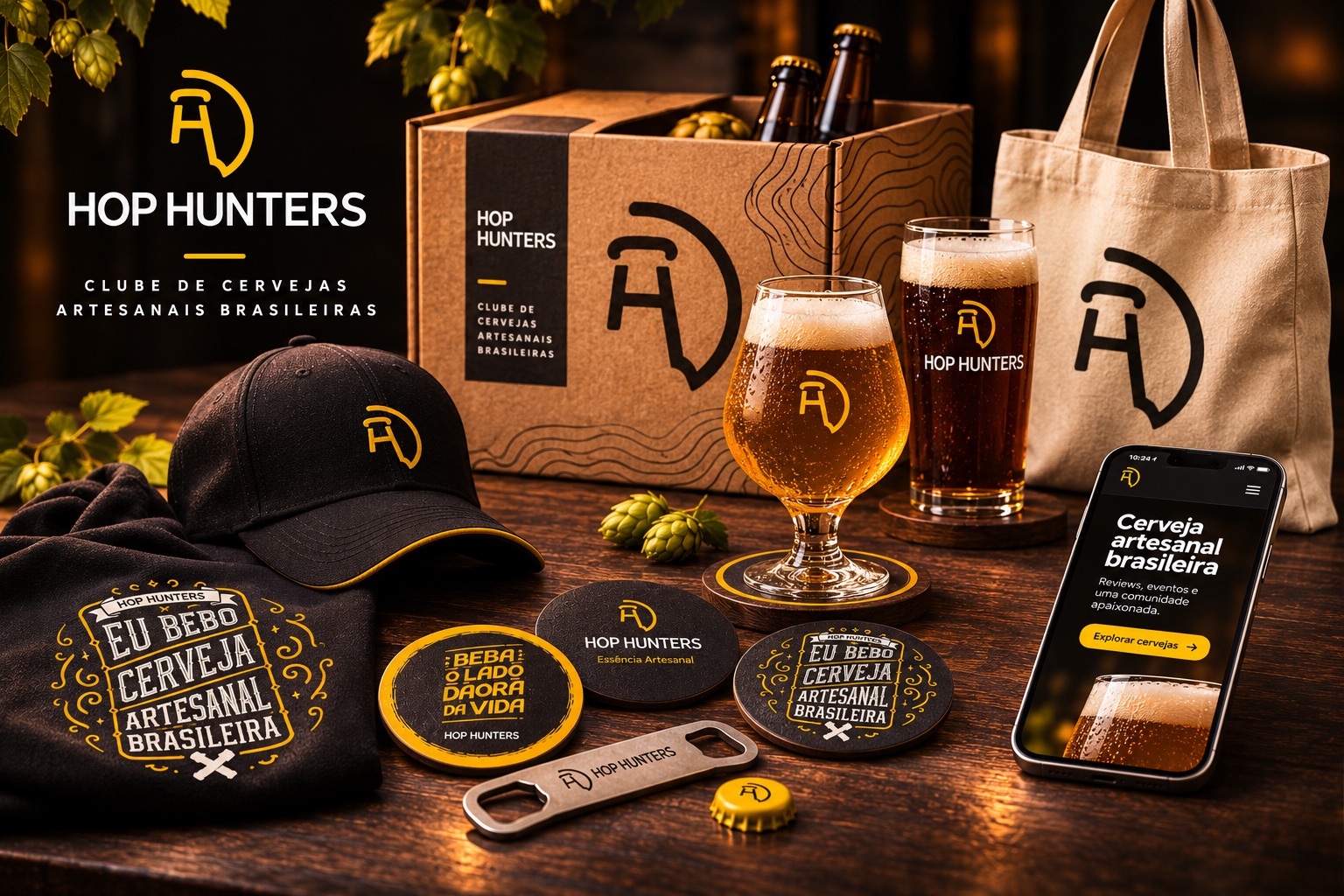
The full Hop Hunters kit: box, glasses, coasters, cap, tote, opener and the website on a phone
The full kit
Members pouring craft beer into Hop Hunters glasses marked Ano VI and Ano VII
Ano VI, Ano VII
09

The last box

On September 12, 2023, after almost a decade of monthly boxes — through a pandemic — the club announced it was closing. The September kit still shipped. The comments read like a guestbook.

“Fui assinante por muitos anos e posso dizer que foi o melhor clube de assinaturas que já existiu.”

— A member, on the club’s farewell post — September 2023
Mostrando em português