All work

Joana Salvati

Semi-jewellery that speaks like a luxury house

A semi-jewellery brand built to sound like an international luxury house — a name, a strategy and a mark drawn as one continuous diamond line.

Role

Brand strategy, naming & identity

Year

2015

Team

Espinafre Comunicadores — my studio

Client

Joana Salvati

  • 01The challenge: a brand with a discourse of exclusivity, modelled on the international luxury houses, to stand apart from everyone else selling semi-jewellery.
  • 02A brand that breathes novelty: exclusive lines, made without fear of daring and always with style. Like love, daring never goes out of fashion — and that is what women need in their every day.
  • 03Made at Espinafre Comunicadores, the design studio I ran from 2012 to 2018: brand strategy, naming and identity.
Joana Salvati interface

Identity · The symbol

01

A diamond in one line

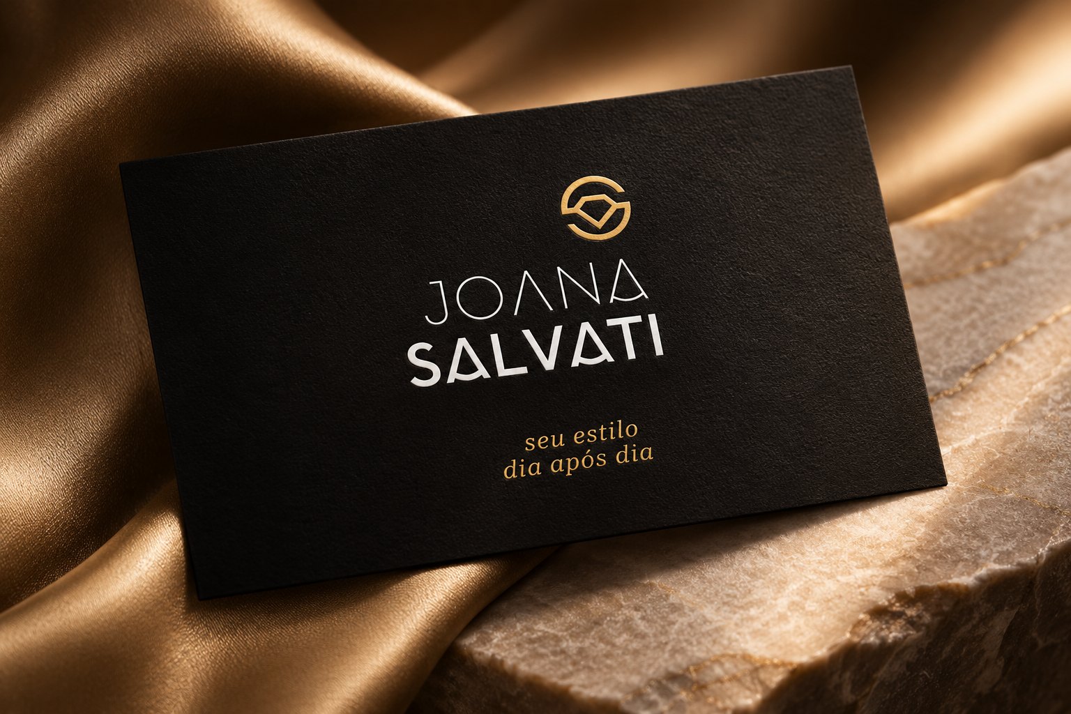
Exclusivity lives in the mark: one continuous line drawn from the diamond — the hardest substance in nature. It doesn’t scratch, so its shine is eternal.

Portrait of a smiling woman in diamond earrings, necklace and ring, hair flowing into dark satin, beside the polished gold Joana Salvati symbol: an S that encloses a diamond
The symbol

Identity · Signature

02

Joana light, Salvati with weight

A fine, open first name over a heavy surname, cut from the same geometry as the diamond — and a promise underneath: seu estilo, dia após dia.
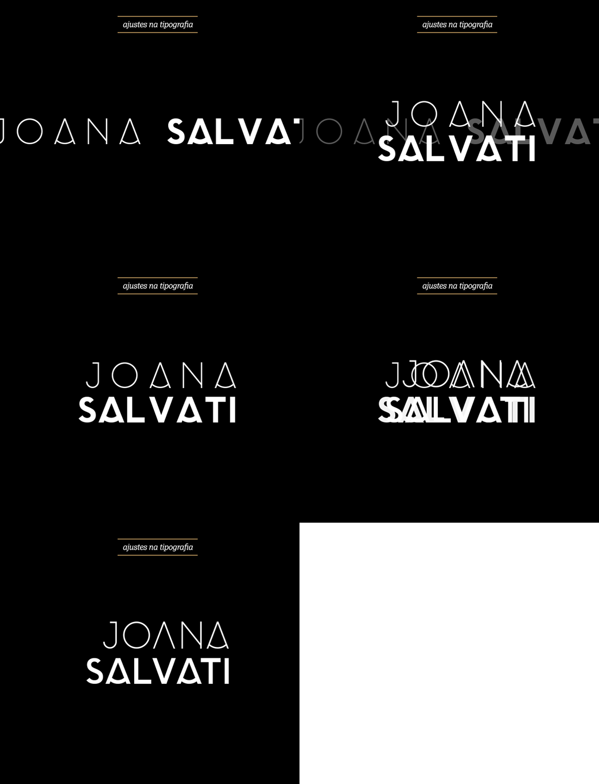
Animated type adjustments: the letters of JOANA SALVATI cut and refined step by step
Type, adjusted by hand
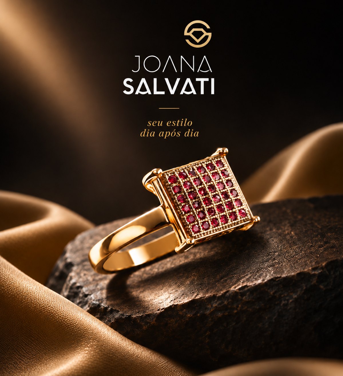
Social post: a gold ring with a square ruby pavé on dark stone and gold satin, under the Joana Salvati logo and tagline
The signature at work

Applications · Packaging

03

Black, gold and nothing else

Bag, box, tag, card, ribbon and pouch: matte black and foil gold — the restraint of a luxury house on every piece the client takes home.
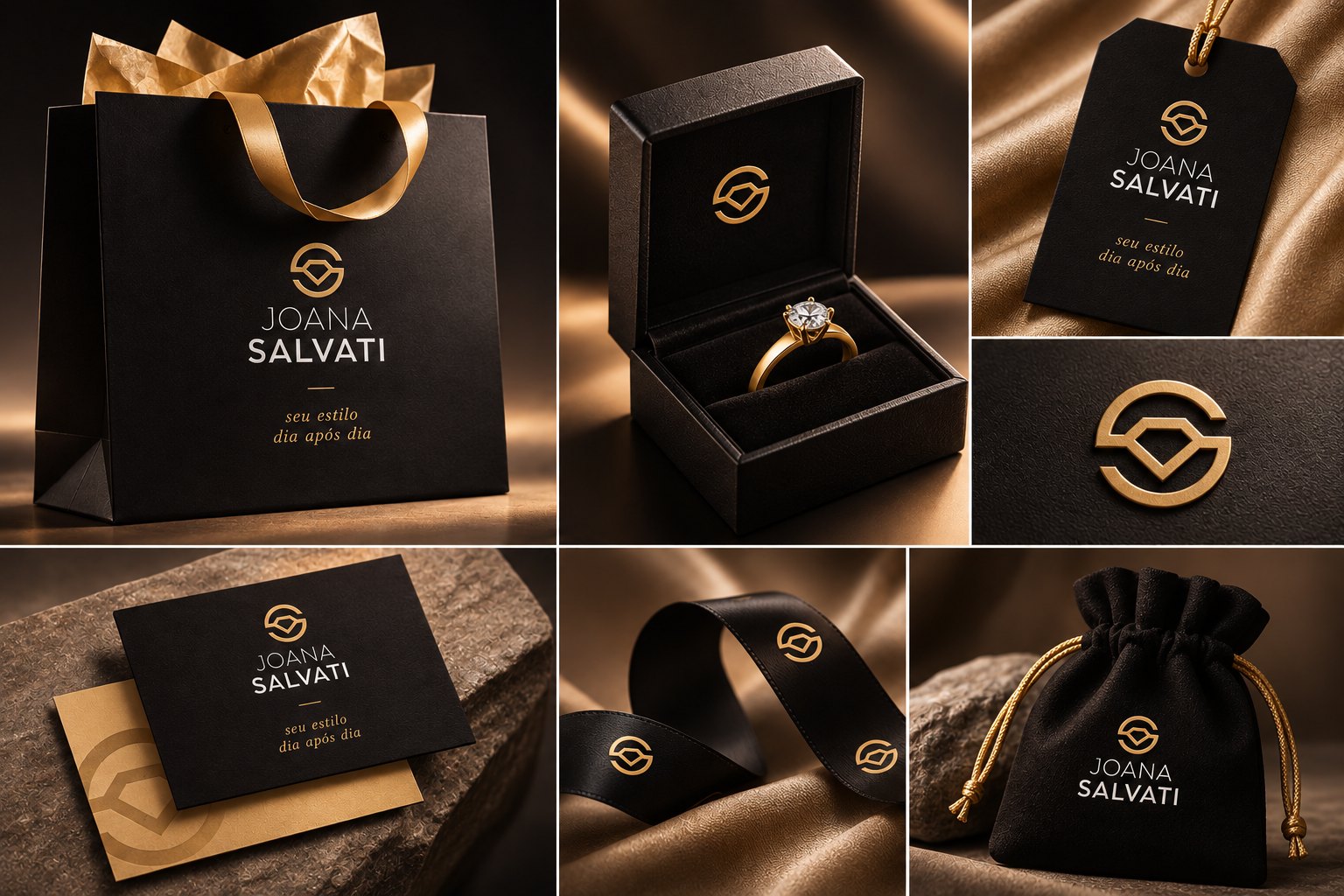
Joana Salvati packaging: black shopping bag with gold tissue and ribbon, ring box, hang tag, embossed symbol, cards, printed ribbon and velvet pouch
The packaging

Campaign · Editorial

04

A page from a luxury house

Product on the left, attitude on the right: the spread speaks the language of the international brands the name was built to stand beside.
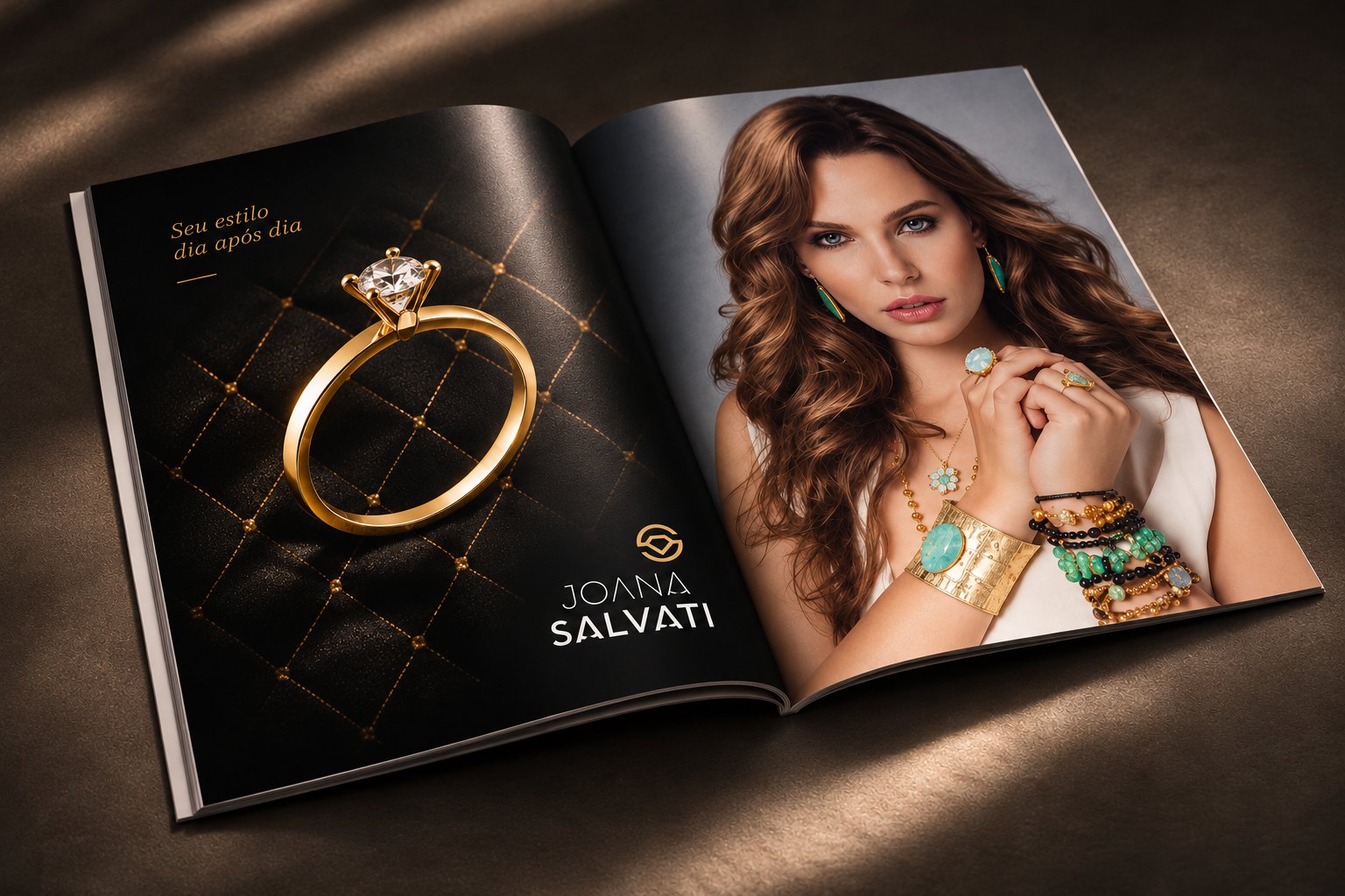
Magazine spread: a gold solitaire ring on quilted black leather with the tagline and logo, facing a portrait of a woman wearing turquoise and gold jewellery
The campaign

Campaign · Product

05

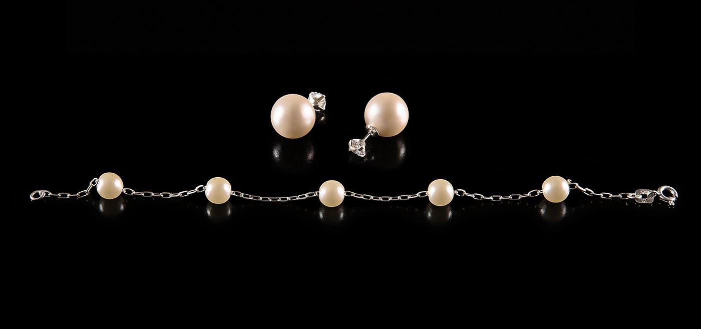
Every piece on a pedestal

Each piece shot like a single jewel against black — turning in the dark for the store, still and reflected for the catalogue.

Animated product film: gold rings with ruby and engraved settings turning one by one against black
In motion
Pearl stud earrings and a pearl station bracelet on black, reflected below
Pearls

“Like love, daring never goes out of fashion.”

— Joana Salvati — brand manifesto
Mostrando em português