
Starting point · Before and after
The brand that already existed
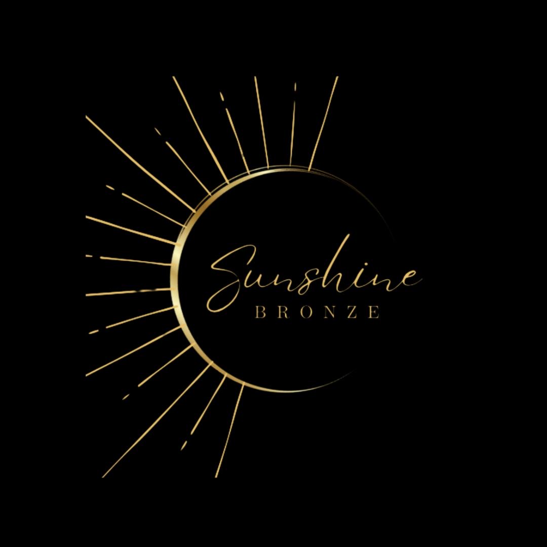
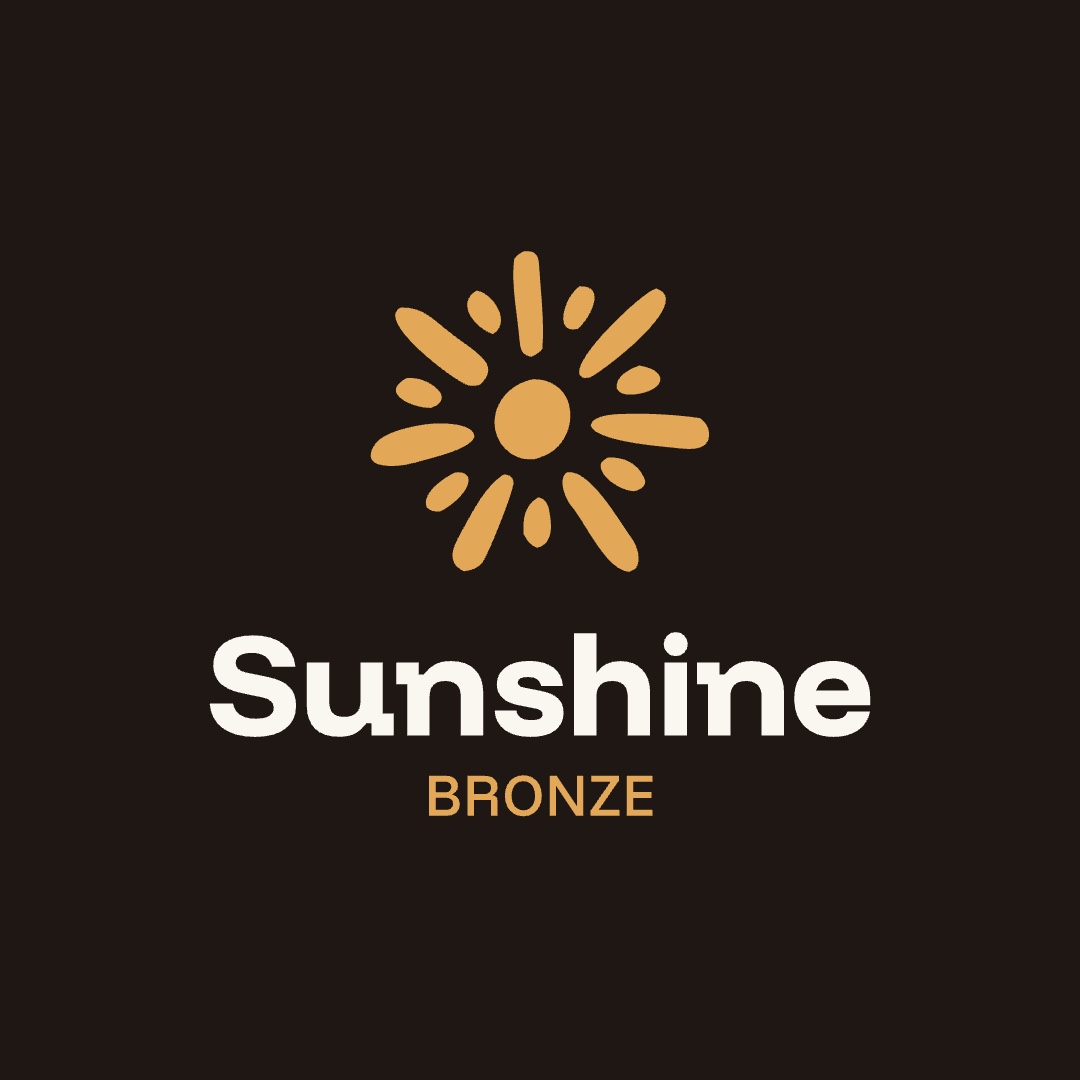
Every sin the new rules would later forbid was in the original mark: a cursive name, metallic gradients, thin generic rays. Drag to see where it ended up.
Essence · What the business really sells
Brand is not the logo
Chapter one, the essence, came before any drawing. Its first finding reframed the business: she does not sell tanning — she sells what happens after, when a woman looks in the mirror and likes what she sees.
Where we started
Brand is not the logo.
The logo is the clothes. So is the colour, so is the type. The essence is the person wearing them.
Before drawing the sun, picking colours or photos, one thing had to be agreed: who Sunshine Bronze is. Everything after grows from here.
The first finding
You don’t sell tanning.
You sell what happens after — when she looks in the mirror and likes what she sees.
- She buys
A tan with a tan line
The service. What’s on the price list.
- She takes home
Recognising herself
Not on the price list — but it’s why she comes back.
- She keeps
Authority over her own body
What she tells her friends about.
Essence · Archetype
She doesn’t serve. She leads.
The archetype reading landed on Regente — the Ruler — read from the owner’s own words: “virar rainha do bronze”, “seja marcante”. Built in four layers, each with a different job: Ruler at the core, Leader in personality, Strategist as proof, Sensualist in expression.
The heart of the brand
Sunshine doesn’t serve.
It leads.
An ordinary studio says
“Come and look pretty.”
An expensive studio says
“Come get the best tan.”
Sunshine says
“Come meet the woman you can be.”
Brand architecture
Four layers, four jobs.
- 01
Ruler
Where her authority comes from. The brand speaks from power, not from asking.
- 02
Leader
How she leads. She doesn’t serve: she takes other women somewhere.
- 03
Strategist
How she proves it. The method turns a crown into authority.
- 04
Sensualist
What the client feels at the end — as a consequence, never a promise.
Essence · The two brand figures
The Sovereign and the Magnetic
Two figures carry the brand: A Soberana — who the brand is, power that brings others along — and A Magnética, what the client feels in her own body. The order matters more than either: the Sovereign leads, the woman recognizes herself, and the magnetism follows.
Who the brand is
A Soberana
“I have power — and I bring others with me.”
- Wants
Position, recognition, being the reference
Not to take part in the market — to lead it.
- Acts
Leads, doesn’t serve. Convokes, doesn’t ask.
She doesn’t ask if you liked it. She opens the way.
- Found in
Her own answers
“Virar rainha do bronze” · “Seja Marcante” · “Forte”
What the client feels
A Magnética
“I feel good in my body — and it shows.”
An ordinary brand promises
“He’ll look at you differently.”
Sunshine promises
“You’ll look at yourself differently.”
Essence · Positioning and voice
Seja Marcante
Positioning in two words, read two ways: the mark on the body, and the mark you leave on the world. The voice follows the crown — “quem tem coroa convoca, não implora”: no “book your slot”, but “your place is marked”.
Positioning
Seja Marcante
“Be marked” — and “be remarkable”
- Marca
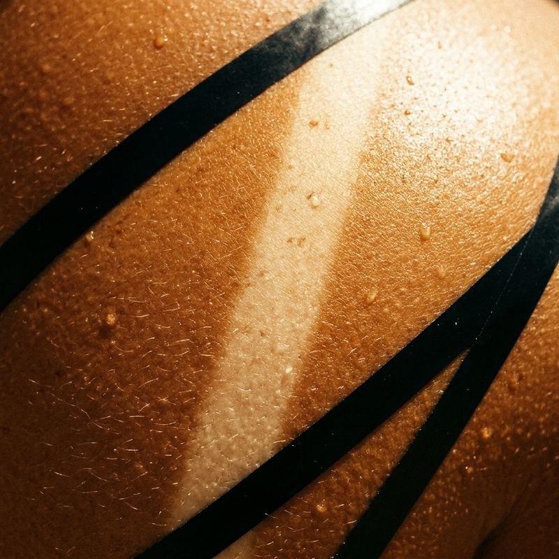
The tan line on the body
The Magnetic. What Sunshine does with technique.
- Marca
The mark you leave on the world
The Sovereign. The place she holds afterwards.
One phrase carrying both sides of the brand in a single word is rare. She found it herself — it stays.
How Sunshine speaks
Who wears a crown convokes.
She doesn’t ask.
“Book your slot.”
“Your place is marked.”
“Grab the promo!”
“Bronze Day is yours.”
Firm always, harsh never — a friend reminding you of your worth.
Essence · The moment that matters
The mirror is the product
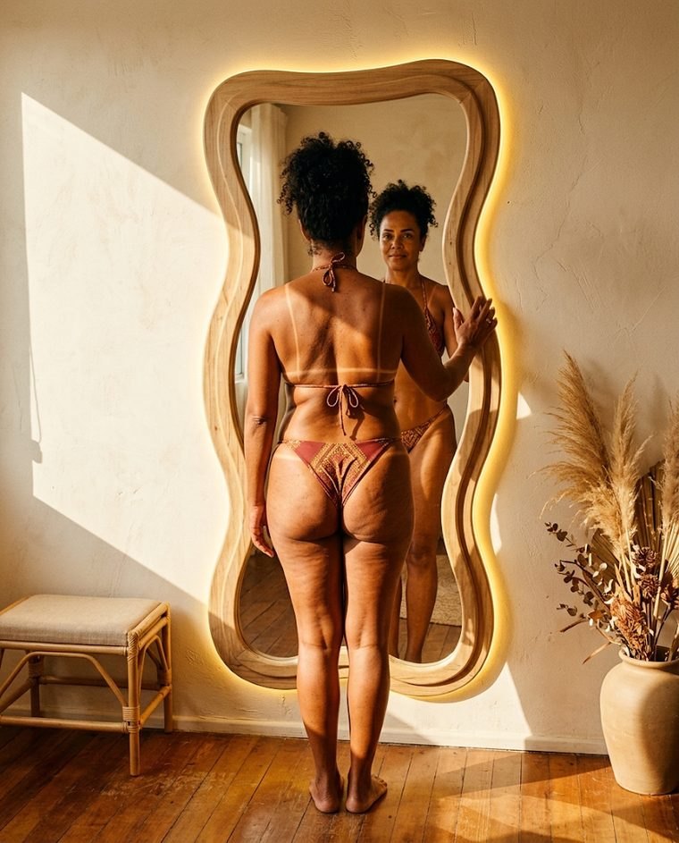
The most important moment in the studio is not the session — it is the mirror after it. That moment became the brief for the photography, and “rainha do bronze” stopped being a nickname and became a position.
The moment that decides everything
The mirror.
She arrives at “I don’t feel pretty” and leaves at “look at me”. The body is the same in both sentences — what moved was the authority over it.
That instant is the product.

Where this leads
“Queen of bronze” isn’t a nickname. It’s a position.
Identity · The symbol
Nothing chosen by taste
Chapter two, the identity, maps every visual decision back to a trait. The sun is drawn by hand on purpose: a solid disc for authority, irregular rays because real suns are not symmetric — and because perfect geometry reads as an app icon.
The concept
A hand-drawn sun.
The disc is the source. The sun and the body — the only filled shape, so it carries the authority.
The rays are drawn by hand. Every one a different length and angle. That irregularity is the warmth: it keeps the sun from reading as an app icon.
Light isn’t perfect, and shouldn’t be. A real sun isn’t symmetric. This one isn’t either.
Identity · Logo system
One system, any ground
Vertical for the profile and the studio wall, horizontal for wide spaces; four colorways so the signature always contrasts with what it sits on.
Versions
Two forms, one system.
Vertical for profile, façade and labels; horizontal for site headers and banners; the symbol alone when neither fits.
Signature colour
Four grounds, four versions.
One rule: the wordmark always contrasts with what’s under it. Cream on cream and gold on gold don’t exist.
Identity · Colour and type
Color from the sun, type with weight
Dourado is the brand color — the symbol and BRONZE; café is the default ground, terracota and bronze for highlights. Two sister typefaces from one family: Funnel Display to shout, Funnel Sans to explain. No script, anywhere.
Sol 17h
#F2C46A
Dourado
#E3A857
brand colour
Bronze
#B4712F
Terracota
#B8552A
Areia
#E7D6BC
Creme
#F7EFE2
Café
#1E1713
default ground
Funnel Display · to shout
Seja
Marcante.
Funnel Sans · to explain
A primeira sessão desenha a marquinha. A segunda corrige qualquer imperfeição. A terceira define e fixa a cor.
No script, anywhere.
Identity · Photography
The photo is 90% of the brand
Photo before logo: light, body, gaze and place were defined before any post template. Then the templates — symbol always top-right, the cream tarja as the house signature — and the physical world, where the mark touches skin.
Photography
The photo is 90% of the brand.
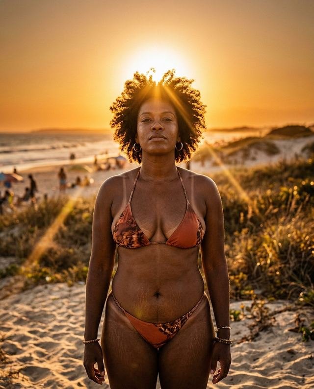
- Light
- Always warm and directional. Late afternoon, hard shadow. Never cold light, never flat flash.
- Body
- Real and unretouched. Stretch marks, cellulite, age. Every age, every body.
- Gaze
- She looks at the camera or at her own reflection. Never away, never a fragment.
- Place
- The studio and the local coast. No generic stock beach.
Identity · Applications
From brand to feed
Applications · feed
How it becomes a post.
Seja Marcante
The first session draws your tan line.
You’ll look at yourself differently.
Symbol always top-right, same size. The cream band — the tarja — is the house signature: one per piece.
Applications · physical
Where the brand touches skin.
The hardest test: one colour, no gradient, no fine detail. If it works embroidered on a towel, it works anywhere.
Deliverable · The living guide
The guide, live
Not a screenshot — the deliverable itself. Open it full-screen here, or send someone the link: it has a page of its own. Scroll it, break the logo, score a pairing, paste a caption into the voice checker.
“O sol faz de graça. A Sunshine faz certo.”